
a brand story
Here, I'm sharing a bit behind my own logo design. A lot of the time, we look at logos and see only what we expect to see. But a lot of logos have hidden messages or meaning in them. The popular brands become memes or fill up click-bait articles with all the details and backstory. Many other brand and logo stories are hidden in plain sight.
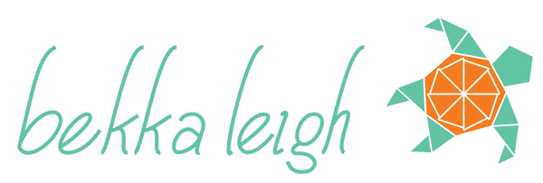
Let's unpack the logo for bekka leigh!
First, the text is hand lettered in an italicised humanist sans serif style. It leans just enough forward to lead toward the sea turtle on the right. The eye almost wants to connect the top of the "h" to the sea turtle arm.

I chose a sea turtle for so many reasons: One of my favourite things about the @vanaqua is just watching the sea turtle in one of the exhibits; sea turtles also tend to live a long life; they have wisened looking faces; they remind me of the importance of our oceans when considering the health of the planet; and they remind me of traditional stories friends have shared about Turtle Island (also known as North America, among other names) which help remind me of my place as uninvited settler on unceded and unsurrendered land.
I've also long been fascinated by fibonacci sequences and the golden ratio, which connects the natural world to art and design. So the sea turtle is contrived of golden ratio triangles, a pentagon, and a heptagon.
In logo design in Western cultures, it's long been thought that left-facing elements were looking to the past, while right-facing elements are looking to the future. I think my intuition and pattern-recognition skills help me look forward and plan ahead quite well, and I wanted to convey that in my personal brand.
The last consideration is the colours I chose. These are very specific with personal and professional messages tied to them. I did have other colour palettes in mind, but this combination was always my first choice.